Template:MerchGallery2

|
Template Guide
This template is designed as an upgrade of Template:TCGMerchGallery (and Template:MerchGallery). It allows up to 24 items (rather than 12), captions are now fully optional, and it also allows the inclusion of optional headings between each row. It's also fully backwards compatible, so any pre-existing use of the old templates only need {{TCGMerchGallery| or {{MerchGallery| changed to {{MerchGallery2| to work with the new template.
| Input | Required? | Parameters |
|---|---|---|
{{MerchGallery2
|
Required | Opening tag. |
| border = |
Optional | Color of the external border. Can either be a hex color code (without the # symbol) or a color template. If not set, will default to {{Black color}}.
|
| background = |
Optional | Color of the background. Can either be a hex color code (without the # symbol) or a color template. If not set, will default to #CCC.
|
| heading = |
Optional | Allows you to add a heading to the top of the Merch Gallery. Cannot be a page heading, so don't include ===these===.
|
| heading color = |
Optional | Sets the text color for the top heading. Only works if | heading = is set. Can either be a hex color code (without the # symbol) or a color template. If not set, will default to #FFF.
|
| heading bg = |
Optional | Sets the background color for the top heading. Only works if | heading = is set. Can either be a hex color code (without the # symbol) or a color template. If not set, will default to #000.
|
| heading2 = to | heading6 = |
Optional | Allows you to add a headings between rows. Cannot be a page heading, so don't include ===these===.
|
| heading2 color = to | heading6 color = |
Optional | Sets the text color for each heading. Only works if the corresponding | headingX = is set. Can either be a hex color code (without the # symbol) or a color template. If not set, will default to #FFF.
|
| heading2 bg = to | heading6 bg = |
Optional | Sets the background color for each heading. Only works if the corresponding | headingX = is set. Can either be a hex color code (without the # symbol) or a color template. If not set, will default to #000.
|
| image1 =
|
Required | Sets image 1. Should be the full file name including .png or .jpg etc with correct capitalisation. Should not include the File: prefix.
|
| size1 = |
Optional | Sets the size of image 1. Don't forget the px. Only works if | image1 = is set. If not set, will default to 170px.
|
| caption1 = |
Optional | Sets a caption for image 1. Only works if | image1 = is set.
|
| image2 = to | image24 = |
Optional | Sets images 2 - 24. Should be the full file name including .png or .jpg etc with correct capitalisation. Should not include the File: prefix.
|
| size2 = to | size24 = |
Optional | Sets the size of images 2 - 24. Don't forget the px. Only works if the corresponding | imageX = is set. If not set, will default to 170px.
|
| caption2 = to | caption24 = |
Optional | Sets captions for images 2 - 24. Only works if the corresponding | imageX = is set.
|
}}
|
Required | End tag. |
Each row has 4 images, and there are 6 rows to make up the 24 possible images. It is possible to have less images in a row, or to make the whole gallery less wide, by not including the corresponding images. See the examples below.
Examples
Example 1
Input:
{{MerchGallery2
| border = 0000FF
| background = {{White 2 color}}
| image1 = Spring 2011 Sneak Peek tins.jpg
| size1 = 175px
| caption1 = Image 1 Caption
| image2 = TCG EX Power Tins Group Shot.jpg
| size2 = 300px
| caption2 = Image 2 Caption
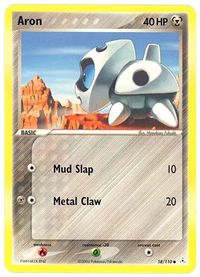
| image5 = AronEXHolonPhantoms58.jpg
| caption5 = Image 5 Caption
| image6 = Spring 2011 Sneak Peek tins.jpg
| size6 = 200px
| caption6 = Image 6 Caption
}}
Output:
 Image 1 Caption |
 Image 2 Caption |
 Image 5 Caption |
 Image 6 Caption |
Example 2
Input:
{{MerchGallery2
| border = 0000FF
| background = {{White 2 color}}
| heading = An Example Heading
| heading color = {{Field egg color}}
| heading bg = 008080
| image1 = Spring 2011 Sneak Peek tins.jpg
| size1 = 175px
| caption1 = Image 1 Caption
| image2 = TCG EX Power Tins Group Shot.jpg
| size2 = 300px
| caption2 = Image 2 Caption
| image3 = AronEXHolonPhantoms58.jpg
| size3 = 200px
| image4 = TCG EX Power Tins Group Shot.jpg
| size4 = 180px
| caption4 = Image 4 Caption
| image5 = AronEXHolonPhantoms58.jpg
| caption5 = Image 5 Caption
| image6 = Spring 2011 Sneak Peek tins.jpg
| size6 = 200px
| caption6 = Image 6 Caption
| heading3 = A Second Example Heading
| heading3 color = 008080
| heading3 bg = {{Field egg color}}
| image9 = TCG EX Power Tins Group Shot.jpg
| caption9 = Image 9 Caption
| image10 = AronEXHolonPhantoms58.jpg
| size10 = 200px
| image11 = TCG EX Power Tins Group Shot.jpg
| size11 = 180px
| caption11 = Image 11 Caption
}}
Output:
| An Example Heading | |||
|---|---|---|---|
 Image 1 Caption |
 Image 2 Caption |

|
 Image 4 Caption |
 Image 5 Caption |
 Image 6 Caption |
||
| A Second Example Heading | |||
 Image 9 Caption |

|
 Image 11 Caption |
|
